Designing Brand Identity for Indian D2C & Manufacturers
Every few months, a business comes to us and says something like: we have a great product, we just need a logo and maybe a new website. After years of doing this work across D2C founders and industrial manufacturers, across service businesses and exporting companies, we have learned that what they actually need is almost always the opposite. The logo is the last decision. The first is clarity about who the business is, who it is for, and what it wants the world to believe about it before a buyer ever speaks to the team.
The businesses that ask this question are often dealing with a very specific set of symptoms. Sales cycles that run longer than they should. Referrals that arrive but struggle to convert. A website that looks reasonable but produces very few enquiries. A product that the team knows is premium but that buyers treat as a commodity. A company that keeps having to explain itself from scratch in every new conversation because nothing it has put into the world has built sufficient context ahead of time.
These are brand identity problems. Most businesses simply fail to recognise them as such.
This guide, by The Subtext, is for any Indian D2C founder or manufacturing company owner who suspects something is off but cannot quite name it. We will walk through what brand identity design actually involves, what branding design includes at each level of investment, why colour and typography choices matter differently in the Indian market, and what building it properly looks like in practice.
Brand Identity Is Infrastructure, Full Stop
The most persistent misconception about brand identity design in India is that it belongs in the marketing budget as a discretionary line item. It does sit in that budget. But the framing misses what brand identity actually does for a business.
A well-built brand identity system works as a salesperson before the pitch. It builds trust before the question is asked. It states the brand position before the buyer asks for one. All of this happens simultaneously and without anyone on the team being present. It operates before any human interaction takes place. When a procurement officer at a large manufacturer receives quotes from two suppliers, the one with consistent visual identity branding across their email signature, proposal template, website, and packaging will be perceived as more organised and dependable. The actual product quality may be identical. The perception is asymmetric. That asymmetry is worth real money.
The same mechanism operates in D2C. When a first-time buyer lands on a product page or Instagram profile and encounters an incoherent visual system. Different fonts appear across pages. The colour palette feels borrowed. The photography looks like it belongs to three different brands. The buyer rarely consciously identifies any of this as a problem. They feel uncertain. Uncertainty becomes hesitation. Hesitation becomes a lost sale that never shows up in any report.
Every digital marketing rupee a business spends runs on top of the brand identity beneath it. When the foundation is weak, the spend does less work than it should. This is why, at The Subtext, we look at the brand foundation before recommending anything in the way of digital marketing services.
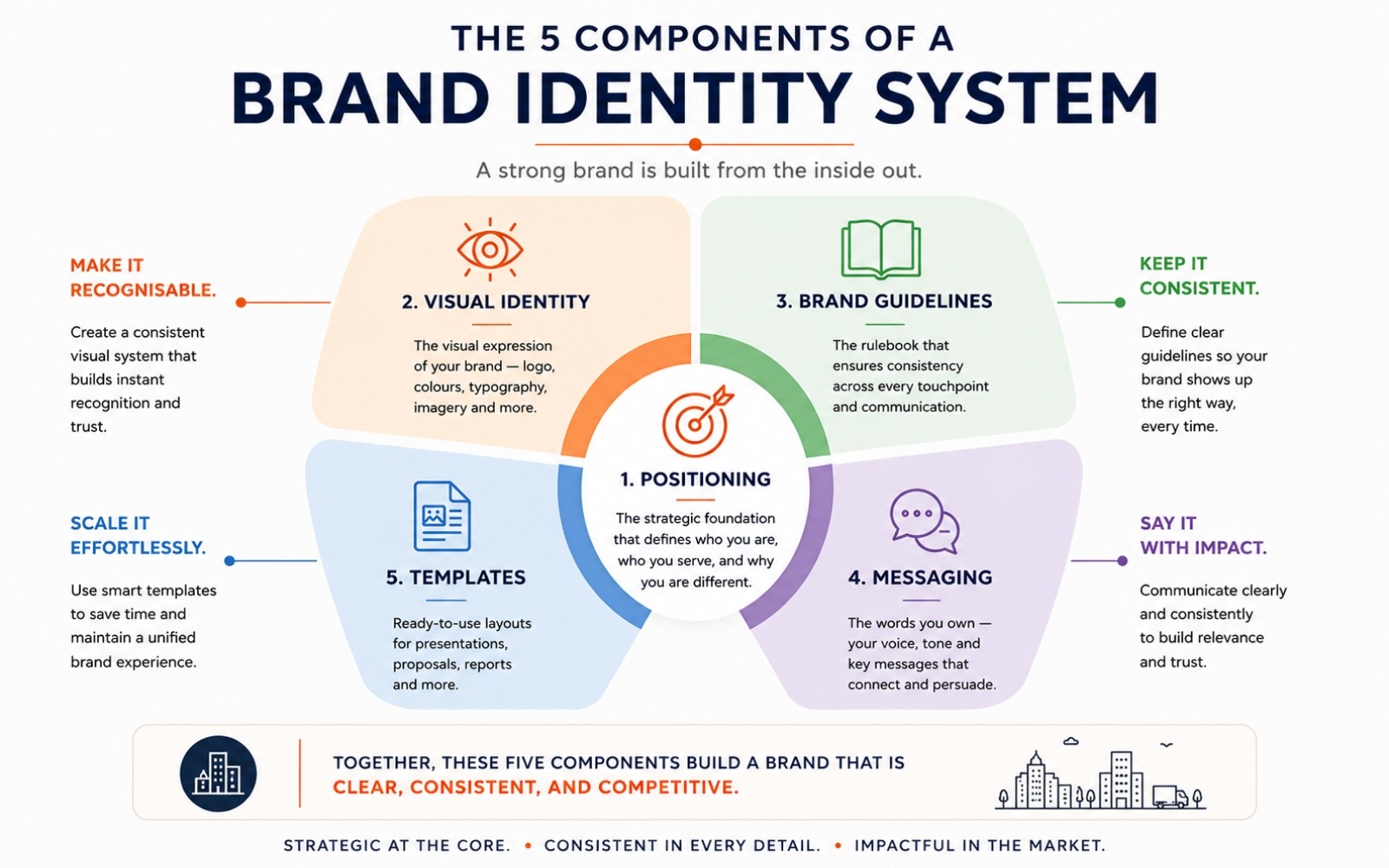
What Branding Design Includes: The Complete Picture
Ask ten people what branding means and you will get ten answers. Most of them describe outputs: a logo, a colour scheme, a new website. None of them describe the work itself. Here is what branding design includes when it is built with the intent of lasting.
Brand Positioning and Strategy
Before a single design file is opened, the most important work is strategic. What position does this business want to own in the buyer’s mind? What does it stand for that the nearest competitor lacks? Who is the primary buyer and what is the one thing they need to believe before they will consider purchasing?
Brand positioning for SMB businesses in India is the step that gets skipped most consistently, because it feels abstract and the pressure is to get to visible deliverables quickly. But positioning determines every downstream decision. Without it, visual choices are aesthetic guesswork.
Visual Identity System
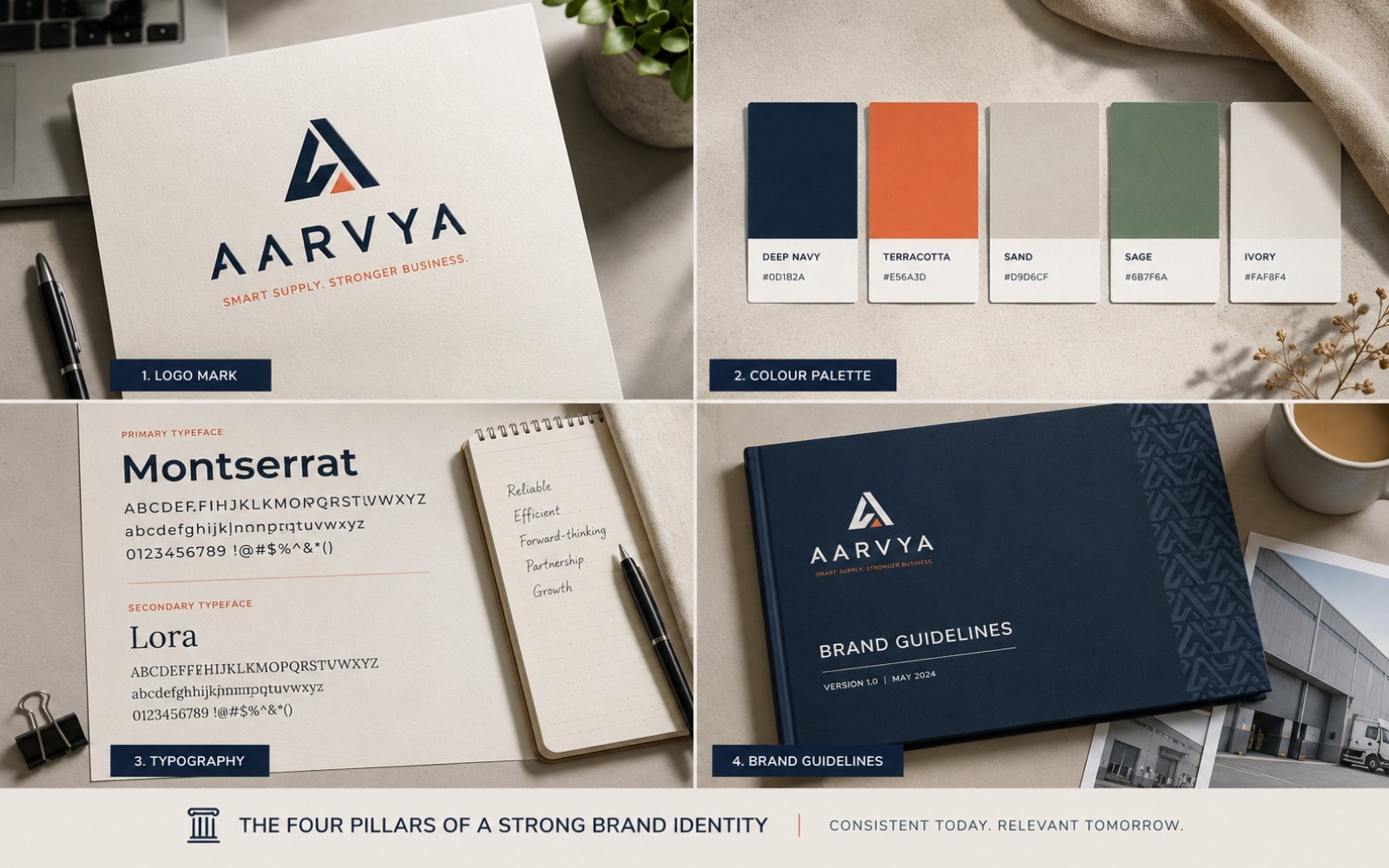
Creating a visual brand identity that works means building a complete system: logo, colour palette, typography, iconography, and photography style as an integrated set of decisions that make a coherent argument together. Each element on its own is a preference. Together they are a brand.
The logo is the most visible part but the least important decision in isolation. A logo designed without a companion colour palette and typographic system becomes an element that gets improvised on by every vendor who touches it. We go into the specifics in our piece on brand logo principles for Indian businesses.
Brand Guidelines Document
Brand guidelines India businesses consistently underinvest in. The brand guidelines document codifies every visual and verbal decision made in the identity process. Without this document, every new vendor or team member is free to reinterpret the brand. Over three to five years, a business without brand guidelines ends up with a fragmented visual identity that costs significantly more to fix than the guidelines would have cost to produce.
Messaging Framework
The messaging framework is the verbal equivalent of the visual system. It defines the brand’s tone of voice, the language it uses consistently, and the things it chooses to leave unsaid. Without it, the website, the pitch deck, the sales call, and the product caption each develop their own independent voice. The brand starts sounding like several different companies.
Application Templates
A brand identity that exists only as a guidelines PDF is incomplete. Application means building the templates that take the brand into daily use. This covers proposals and pitch decks, email signatures, social media templates, packaging specifications, and exhibition materials. This is where the brand becomes operational rather than theoretical.
Why Colour and Typography Decisions Matter More Than Most Indian Businesses Realise
This is the part of brand identity that gets reduced to personal preference more often than any other. Founders pick colours they like. They choose fonts that look contemporary. Both decisions are made aesthetically rather than strategically, and both have consequences that last for years.
Colour Psychology in the Indian Market Context
Colour carries cultural weight in the Indian market that differs from Western frameworks. Red communicates auspiciousness in many Indian cultural contexts but reads as urgency or warning in global B2B environments. Saffron carries religious associations that are entirely appropriate for some categories and actively counterproductive in others. White, which many international brands use to signal premium and minimal, works well in urban D2C contexts but can feel cold or clinical in categories where warmth and trust are the primary emotional signals.
The mistake we see most often in Indian brand identity design is importing a colour palette from a foreign reference brand without examining whether the associations transfer. A direct-to-consumer wellness brand that copies the sage green and off-white palette of a Scandinavian competitor is making a visual system that means nothing specific to the Indian buyer it is trying to reach. The palette may look modern. It is doing no psychological work.
Colour selection in a brand identity system needs to begin with three questions: what does this colour communicate in the specific cultural context of the target buyer, what are the dominant colour conventions in this product category in India, and what is the opportunity to differentiate by deliberately breaking from those conventions in a way that still serves the brand positioning.
Typography and Legibility in Indian Digital Contexts
Typography in Indian D2C and B2B digital contexts carries a specific challenge that is rarely discussed: the vast majority of Indian buyers experience branded content on a mobile screen, often in variable lighting conditions, often while multitasking. A typeface that reads as sophisticated on a desktop design presentation can become nearly illegible at 14px on an Android phone with a slightly smudged screen.
We see businesses choose display typefaces such as condensed, high-contrast, stylised fonts because they look distinctive in a brand presentation, then discover that the same typeface on a product label or a WhatsApp catalogue image is functionally unreadable by a significant portion of the audience.
Typography in a brand identity system should be chosen for three properties simultaneously: the personality it communicates at display size, the legibility it delivers at body copy size, and the scalability it maintains when reproduced in print, on screen, and in digital-first environments that range from Instagram to a PDF catalogue to a product sticker.
Getting these decisions right is part of what makes social media marketing and branding work as a coherent system rather than a series of unrelated visual choices.
How to Audit Your Existing Brand Identity Before Deciding What to Do Next
Most businesses that come to us asking about a rebrand or a refresh have never done a structured audit of what they currently have. They know something is off. They cannot be specific about where. A brand audit is the process that produces that specificity, and it is the most useful thing any business can do before committing to any branding investment.
The Four Questions a Brand Audit Should Answer
1. Does the current positioning still accurately describe the business?
Write down in one sentence what your brand stands for and who it is for. Then ask three people who work in the business to do the same independently. If the answers are materially different, the positioning has either never been defined or has drifted from whatever it originally was. This is the most important diagnostic because everything else depends on it.
2. Is the visual system consistent across all active touchpoints?
Pull together every active brand touchpoint. The website, the LinkedIn profile, the email signature, the proposal template, the packaging, the exhibition or sales materials. Lay them side by side and ask a simple question: do these look like they come from the same company? If the answer requires qualification, the visual system is fragmented. The next question is whether the fragmentation is executional. Better guidelines and templates can fix executional drift. When the fragmentation is strategic, the system itself needs rebuilding.
3. Is the messaging consistent across channels?
Read the homepage copy alongside the LinkedIn about section. Then read a sales deck introduction and a recent social media caption. Do they use the same language to describe the same things? Do they establish the same priorities? A business that describes itself as a premium supplier on its website and then leads with price on its social media is sending contradictory signals that buyers absorb without consciously registering them.
4. Does the brand identity match where the business is going as well as where it has been?
A brand built for a startup entering the market often fails to scale with the ambitions of the business. A manufacturer who was reaching local buyers when they built their first brand identity and is now developing export relationships needs a brand that can operate in both contexts credibly. The audit question is whether the brand is capable of representing the future, irrespective of how accurately it captured the past.
The answers to these four questions tell you whether the problem is a refresh, a partial rebuild, or a full rebrand. Skipping the audit and commissioning work based on a feeling produces projects that solve the visible symptoms without addressing the root cause.
Brand Identity and Pricing Power: The Commercial Case
This is the section that matters most to business owners who are sceptical about whether brand identity design is worth the investment. We will make the commercial argument directly.
Pricing power is the ability to charge what a product or service is worth without the conversation defaulting to price as the primary basis of comparison. It is what separates businesses that grow margin as they scale from those that grow revenue and watch margin erode.
Brand identity is one of the primary mechanisms through which pricing power is created. The reason is perceptual. A buyer evaluating two options that appear technically equivalent will default to price as the deciding variable because price is the only clear difference. A buyer who arrives at the comparison with a pre-formed belief that one brand is the more credible, more premium, more appropriate choice will treat the options as distinct. The brand has already done the work of creating differentiation before the price is discussed.
How This Works in Practice for Indian D2C Brands
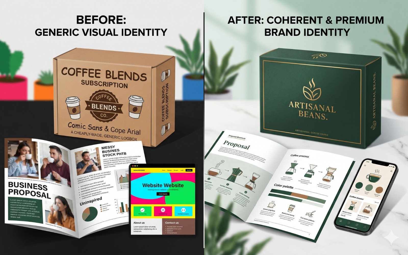
A D2C personal care brand we worked with was selling a genuinely high-quality product at a price point that buyers were consistently pushing back on. The product formulation was strong. The packaging was clean. The brand identity was generic. A name. A sans-serif logo. A white background and a colour palette that read as competent but interchangeable with forty other brands in the same category.
The work had nothing to do with changing the product or the price. It was to build a brand identity that gave the buyer a reason to believe this product was worth the premium before they reached the pricing decision. Design visual identity work that gave the brand a specific visual world, a specific tone of voice, and a positioning that made the premium feel earned rather than asserted. The conversation about price changed because the brand identity changed what was being compared.
How This Works in Practice for B2B and Manufacturing
In corporate identity design for manufacturing and B2B clients, the mechanism is slightly different. The pricing pressure in B2B rarely arrives at the consumer level. It comes in commercial negotiations, in RFQ evaluations, and in procurement decisions where the buyer is accountable to someone else for the choice they make.
A supplier that looks more credible, more organised, and more established in every brand touchpoint gives the procurement officer a stronger internal case for choosing them. The brand reduces the perceived risk of the choice. Reduced perceived risk creates pricing headroom. This is how brand identity translates directly into margin in a B2B context.
The Brand Identity Mistakes Indian Businesses Make Most Often
We have seen the same errors repeated across enough projects to say with confidence that these are structural patterns.
Designing the Logo Before Defining the Positioning
A logo brief that begins with visual preferences: colours the founder likes, fonts that look modern, styles that resemble admired brands. Without first defining what the brand stands for produces a logo that looks fine and does nothing specific. It will need to be redesigned within two to three years because the business will have evolved and the logo will have no strategic root to grow from.
Treating Brand Guidelines as a One-Time PDF
Brand guidelines are a living reference document. When a business produces them and then files them away, the brand fractures at the first application. Guidelines need to be the reference material for every external brief, every internal design request, and every vendor onboarding. Guidelines that go unused offer no practical value at all.
Building a Brand Identity for the Founder Rather Than the Buyer
This is one of the most common mistakes we see in brand identity for Indian companies. The founder has strong visual preferences. The brand ends up reflecting those preferences rather than the psychology and expectations of the actual buyer. A B2B buyer evaluating industrial equipment suppliers has different trust signals than a 26-year-old buying skincare online. Brand identity design that confuses these two is doing the wrong job.
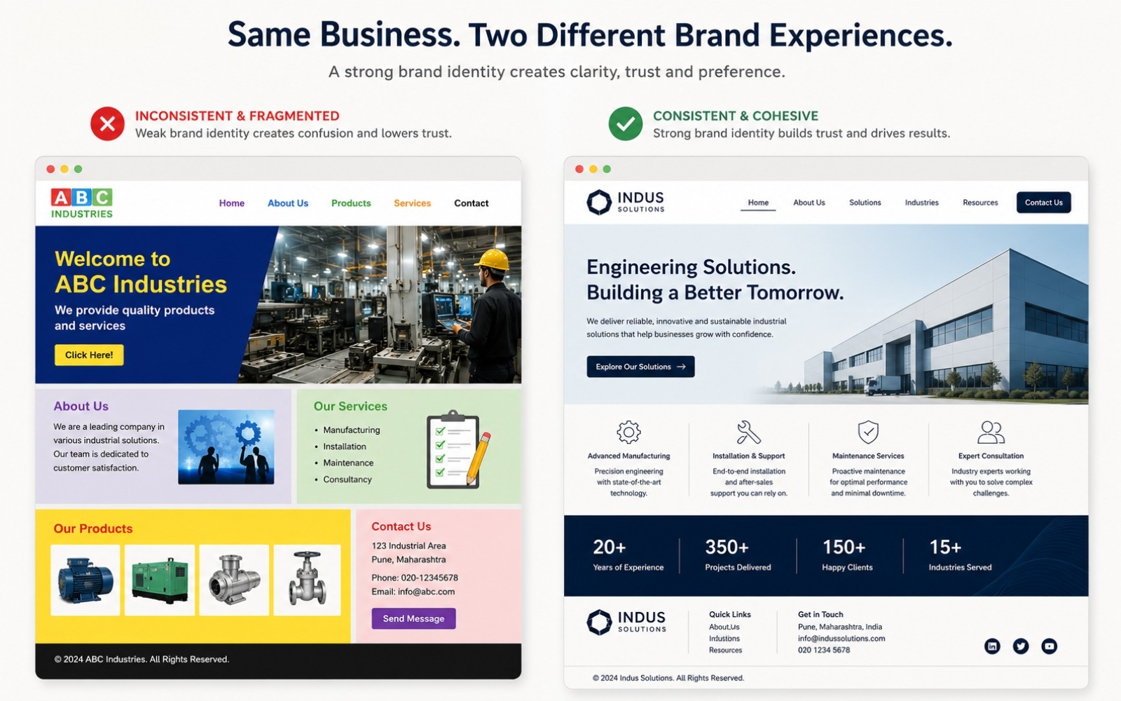
Inconsistency Across Touchpoints
A business that maintains one visual language on its website, a different one on its packaging, and a third on its social media is carrying three different brands simultaneously. Each one undermines the others. Inconsistency is almost always a symptom of the same root cause: no brand guidelines document that was actively followed.
Separating Brand Identity from the Website Build
Brand identity website design works only when the visual system and the website are built from a shared foundation. When businesses commission a website independently of brand identity work, the result is a technically competent design project that belongs to a slightly different company. The disconnect is subtle but buyers feel it.
Symptoms That Are Actually Brand Identity Problems in Disguise
These are the patterns we see in businesses that come to us having tried everything else first.
Growing on Referrals and Hitting a Ceiling
Referral-heavy businesses grow to a point and stop there. Referrals transfer trust between people. When the referred prospect then independently researches the business and encounters inconsistent design visual identity, a website that looks five years old, and a social presence that feels like a different company, the personal trust from the referral erodes. The referral got them to look. The brand had one job: confirm what the referral promised.
Competing on Price When the Product Justifies More
A well-made product being sold at commodity pricing is almost always a visual identity branding failure. Perception precedes evaluation. A buyer who encounters a coherent corporate identity design before they reach the pricing conversation will evaluate the price differently than one who arrives at it through a generic digital presence. The brand frames the value before the negotiation about value begins.
The Team Tells Different Stories
Ask three people from the same business to describe the company in thirty seconds. In a business without a messaging framework, you will reliably get three different answers. The founder talks about vision. The sales head talks about product. The marketing team talks about the category. Together, they produce a buyer who leaves without a clear impression of what the business actually is.
Declining Returns on Digital Marketing Spend
Businesses running digital advertising for two or three years and finding that cost per lead is climbing while quality drops often look to the platform or agency first. More often, the campaigns are driving traffic to a brand identity that cannot convert. Spending more on advertising in that condition makes the problem more expensive. The relationship between social media marketing and branding is where this gap becomes most visible.
Two Indian Brands That Show What Disciplined Brand Identity Does
Bla Bli Blu: How D2C Brand Identity Creates a Category of One
Bla Bli Blu is an Indian fragrance brand doing something most players in this category have historically avoided: taking a clear, unapologetic creative stance and building an entire brand world around it.
Their brand identity is specific. They are for people who find conventional perfumery emotionally generic or aspirationally exhausting. The visual identity, copy, and brand philosophy all make the same argument. The name is unusual and memorable. The copy is written in a voice that belongs to no other brand in this category. The visual language signals rebellion against category norms without announcing that it is doing so.
What this brand has done is solve the hardest problem in Indian D2C: creating permission for a premium price point on an Indian product in a category where imported names carry almost all the perceived prestige. The product quality earns that price. The brand identity creates the context in which a buyer is willing to consider paying it. Without the brand identity, the same product at the same price would be fighting on a field where every other Indian fragrance brand is fighting. With it, Bla Bli Blu has built a separate category around a specific worldview.
Zoho: B2B Corporate Identity Design Built on Conviction
Zoho is the most instructive Indian B2B brand identity case study precisely because of a choice they made that most Indian companies are reluctant to make: they decided to be entirely themselves rather than an aspirationally Western technology company.
Their brand guide describes their logo as “simple, straightforward, and vibrant,” with a typeface designed to be functional and scalable across formats, from a product interface tooltip to a full-building billboard. That is corporate identity design built with architectural intent, codified in a brand guidelines document that every person touching the brand is expected to follow.
The larger story is that Zoho built its brand around principles rather than aesthetics. They are a bootstrapped, India-rooted company that chose to stay private when every pressure in their industry pointed toward VC funding and a Silicon Valley-facing identity. That decision is reflected in how the brand looks, how it speaks, and what it chooses to emphasise.
For any Indian manufacturing or B2B service business reading this: looking like a San Francisco startup is unnecessary to build a credible brand with global reach. The lesson from Zoho is coherence, consistency, and a clear sense of what you stand for.
Rebrand or Refresh: How to Make the Decision
This is one of the questions we get asked most often by established businesses. The brand is years old. Something feels dated or misaligned. The instinct is to start from scratch. That is usually the wrong move.
When a Refresh Is the Right Answer
A brand refresh is appropriate when the strategic foundation is still sound but the visual execution has aged. The positioning still accurately describes what the business stands for. The messaging still resonates with the target buyer. What needs updating is the visual language: a logo that looked modern in 2016 and no longer does, a colour palette that reads as dated, typography that feels behind current category conventions.
A refresh retains the equity the brand has already built. Loyal customers recognise the brand. The sales team knows how to represent it. A refresh updates the exterior without dismantling the foundation.
When a Full Rebrand Is Necessary
A full rebrand is the right answer when the positioning itself has become inaccurate. The business has moved into a new category. The original target buyer is no longer the primary one. A merger or acquisition has changed what the brand needs to represent. Or the brand was never properly built in the first place and is actively working against the business.
The Question That Helps
The most useful diagnostic: does your current brand positioning accurately describe what this business is today and where it is going? If yes, the problem is probably executional and a refresh will solve it. If no, what looks like a visual problem is actually a strategic one and a rebrand is the correct scope of work.
Brand Identity for D2C and Brand Identity for B2B: Same Discipline, Different Emphasis
For D2C Brands
In a direct-to-consumer business, the brand identity carries the entire weight of the customer relationship before anyone on the team has spoken to the buyer. The colour palette, the typography, the caption tone, the product photography, the packaging when it arrives. All of this is the brand working independently.
D2C brand identity design needs to answer an emotional question before it answers a rational one. Before the buyer decides whether this product is the right choice, they decide whether this brand is for someone like them. Creating a visual brand identity that generates this belonging signal is what the entire exercise is building toward.
This is why the social media marketing strategy for a D2C brand lives or dies on the strength of the brand identity beneath it. Without a coherent visual system and a defined brand voice, social content becomes a disconnected series of posts rather than a brand-building exercise.
For Manufacturing and B2B Companies
The emotional layer still matters in B2B, but it operates differently. A procurement officer evaluating two suppliers is still a human being making a judgement call under uncertainty. The supplier whose brand identity communicates stability and seriousness will be perceived as the lower-risk choice before the commercial terms are reviewed.
Brand positioning for SMB manufacturing businesses in India is where we see the most opportunity being left on the table. A company with genuine technical capability and fifteen years of export experience often presents itself with the same generic visual identity as a competitor with six months of operations. The brand does no work to communicate the difference.
We work with B2B companies on this through our digital marketing agency services, but the brand foundation always comes first.
Which Industries Does This Apply To
The most common objection from manufacturing clients: our buyers care about specifications and delivery timelines. Price is the primary variable. Branding rarely enters their stated criteria.
Partially true. Structurally incomplete. Buyers in industrial categories do care primarily about those things. But brand identity for Indian companies does its most important work before the buyer reaches the evaluation stage. It determines whether the business makes the shortlist.
Brand identity applies directly to:
- Chemical and industrial manufacturers building export pipelines where credibility is evaluated from a website and LinkedIn profile before any conversation takes place
- Textile businesses supplying fashion labels that have strong aesthetic standards of their own
- Logistics and supply chain companies competing with platform-backed national players who carry significant brand equity
- Healthcare and medical equipment suppliers who need to pass institutional procurement scrutiny at hospitals and clinic groups
- B2B service businesses and consultancies where the brand experience is inseparable from the service experience
- D2C food and beverage brands competing for digital discovery and physical shelf space simultaneously
- Professional services firms where every client interaction is a brand interaction whether or when it is recognised as one
In every category, the mechanism is the same. When two options appear equal on the dimensions the buyer consciously evaluates, the brand is what tips the decision. The business without a well-built brand identity is always competing on price because it has no other lever.
Full Branding Package Cost in India: An Honest Breakdown
The internet is full of vague ranges on this question. Here is a direct answer based on what is actually available in the Indian market and what each tier genuinely delivers.
- Freelance logo work, Rs. 5,000 to Rs. 30,000: You receive a logo file, possibly with a colour code or two. No brand strategy, no brand guidelines document, no messaging framework. This is a logo. It is an appropriate starting point for a business testing a concept before product-market fit. It is an expensive mistake for a business that has already found its footing.
- Mid-tier agency or boutique branding studio, Rs. 80,000 to Rs. 3,00,000: This is where proper brand identity design work begins. A business should expect brand positioning work, a complete visual system, and brand guidelines India documentation. A messaging framework and a set of application templates should also be in scope. This scope is appropriate for most growing Indian businesses that need to build the brand infrastructure to support the next phase.
- Full brand identity design company engagement, Rs. 2,50,000 and above: This scope covers deep positioning discovery, a comprehensive visual system, and full brand guidelines. Messaging architecture, website design integration, and ongoing brand governance are also included. The right investment for a business entering a new market, repositioning after significant growth, or at a scale where brand inconsistency is actively costing revenue.
The question we ask businesses who are uncertain about the investment: what is the commercial cost of the problem you are currently living with? Longer sales cycles, lower pricing power, inconsistent conversion. Quantify that honestly and the investment usually looks proportionate quickly.
Brand Identity Website Design: Where Everything Has to Come Together
Your website is the single highest-stakes application of your brand identity. Every buyer, prospect, or partner who is evaluating you seriously will land there. What they experience in the first ten seconds is almost entirely determined by the quality of the brand identity system applied to the design.
The most common failure pattern we see in Indian business websites is three different visual eras coexisting on the same page. A logo from 2012. Photography from 2019. A colour palette chosen last year. Each element is individually defensible. Together they communicate that nobody is in charge of this brand.
Brand identity website design that works means every element on the page is making the same argument. The typography, the colour application, the image selection, the copy tone, the CTA language should all point in the same direction. When they do, the page builds trust without the buyer consciously noticing. When they pull in different directions, visitors feel friction they cannot name and leave.
This is also why commissioning a website independently of brand identity work produces results that consistently disappoint. The website might be technically well-built. But if the brand foundation it is applying is inconsistent or undocumented, the website will reflect that inconsistency regardless of how competent the designer is.
The Sequence That Actually Works
Brand identity projects fail most often when they begin at the wrong stage. Here is the order that produces durable results.
Stage 1: Positioning Discovery
Every serious brand identity project begins with a structured discovery process. What category is this business in? What does it own within that category that the closest competitor lacks? Who is the primary buyer and what is the single most important thing they need to believe before they will act? These answers are the actual brief for any logo and brand identity designer. Without them, design decisions are expressions of personal taste rather than strategic intent.
Stage 2: Visual System Development
With positioning clear, the visual system is built as a unified architecture. Colour palette selection is derived from the positioning, the buyer psychology, and the category conventions. Particular attention goes to how those choices land in the specific Indian market context the brand is operating in. Typography is chosen for personality at display size and legibility at body copy size. The logo is developed within this context rather than before it.
Stage 3: Brand Guidelines
Every decision made in Stage 2 is codified into the brand guidelines document. This is the reference material for every future design decision, every external vendor brief, and every new team member onboarding. Without it, Stage 2 produces assets rather than a system.
Stage 4: Application
The brand identity is applied across the highest-priority touchpoints first. Website and social media templates come first. Then the pitch deck or company profile, packaging or product presentation, and core communication materials. This is where the work becomes visible and operational.
Stage 5: Verbal Identity and Copy
Brand identity extends into language. The messaging framework needs to be applied through actual copy. Website pages, social media content, proposals, and sales materials all need to carry the same voice. Visual and verbal identity working together is what produces a brand that feels coherent rather than merely consistent. Our marketing writing services are structured to function as part of the brand identity build rather than as a separate project bolted on afterward.
Questions Businesses Ask Us Before Starting a Brand Identity Project
We already have a logo. Do we need a full brand identity?
A logo is one element in a brand identity system. If the logo exists but the colour standards, typography system, brand guidelines, and messaging framework are missing, what exists is a brand element. That is a different thing from a brand identity. The test: can you hand a single document to a new designer or marketing hire that tells them everything they need to know to represent the brand correctly? If the answer is uncertain, the work is incomplete.
Our buyers care about specifications and price. Does brand identity matter for us?
Your buyers evaluate specifications and price after they have decided to take you seriously. Brand identity determines whether your business makes it into that evaluation at all. A supplier that looks credible and professional in every touchpoint gets into more RFQs, commands more attention in negotiations, and has more pricing headroom than one that lacks these qualities. That asymmetry compounds over years.
What does a full branding package cost for a small Indian business?
A genuine brand identity design engagement including positioning, visual system, and brand guidelines starts at around Rs. 80,000 to Rs. 1,00,000 at the boutique studio level and scales based on scope and seniority. The more useful question is always: what is the cost of the problem this investment is solving? Most businesses that do that calculation find the investment proportionate quickly.
How is a brand identity design company different from a graphic design service?
A graphic design service produces visual deliverables. A brand identity design company builds a strategic system. The process difference is that proper brand identity work begins with positioning and messaging before any design tool is opened. The output difference is the brand guidelines document and the durability of the system over time.
Can we update our brand without starting from scratch?
A brand refresh is often the right answer for established businesses. The goal is to retain the equity already built while resolving inconsistencies and updating the visual language for where the business is going. The decision framework for when a refresh is sufficient versus when a full rebrand is necessary is covered in the section above.
What We See Most Often in Businesses That Break the Pattern
Across the businesses we have worked with, the pattern that separates those that break through a growth ceiling from those that stay stuck below it is almost always the same. The ones that break through stopped treating brand identity as a cosmetic project and started treating it as infrastructure.
They made the investment once, built it properly, and then watched every downstream marketing decision perform better because the foundation beneath it was finally coherent. Their ad spend converted better. Their referrals closed faster. Their sales team started telling the same story. Their pricing held in negotiations where it had previously eroded.
The businesses that stay stuck keep trying to solve brand identity problems with marketing execution. They spend more on ads. They hire a new social media manager. They commission a new website. Each of these investments does less than it should because the brand beneath it is still fragmented.
If you are at the point where you know something is off but are still trying to diagnose where, our branding work at The Subtext always begins with the brand foundation rather than with execution recommendations.
And if the brand foundation is in place but the content and copy layer is where things are breaking down, our marketing writing services address exactly that gap.
Brand identity design is the infrastructure your entire marketing investment runs on. Build it with the same rigour you bring to the product itself. Everything downstream performs better when you do.